


The King Con Ore Bin Ink Project - Part 2
In which I detail how the inks get made, the colors created, and finally reveal the art. Just get to it already.

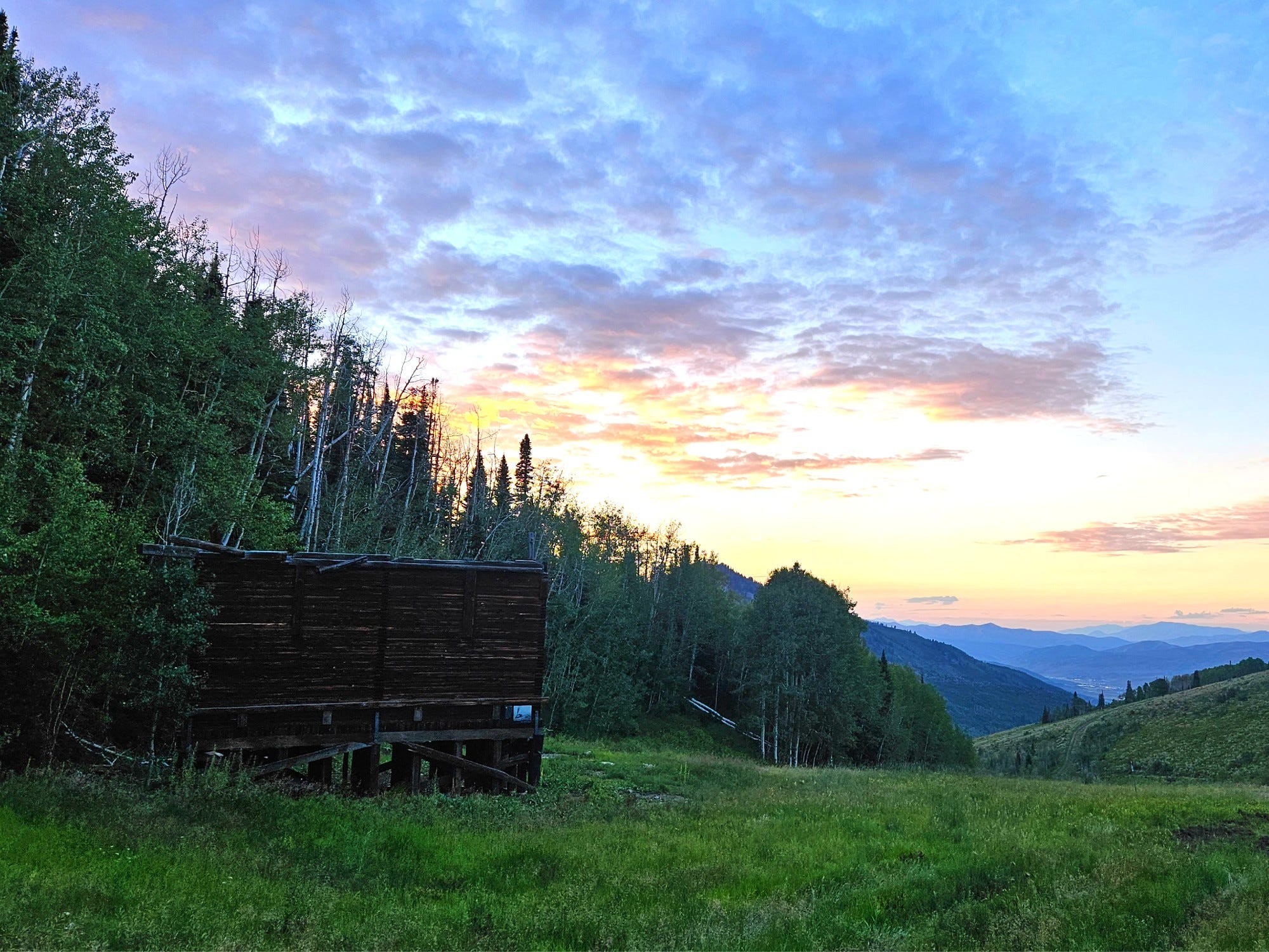
When we last left this project, I had shared with you how I spent my summer - hiking out to the King Con Ore Bin, collecting plants, foraging for materials, getting harassed by coyotes - all in the name of Art, with a capital A. If you missed all that, you should go back and read Part 1. Riveting stuff folks, you don’t want to miss it.
In review the plan for this crazy project was:
Collect plants and materials that would be good to make ink with
Make said inks
Use inks to create paintings
Cover ink paintings with encaustic and charcoal for even more detail
Share final paintings with selection committee and let them choose their final painting
Decide what to do with remaining paintings.
Part 1 got us just through Step 1. Now, on to the rest of the steps…
Now, we move on to steps 2 through 6 and sharing the fun parts - how I made the inks, the colors created and then, my god, finally… Will you just get to the end and show us the art for goodness sake?! Yes! Sorry. Jeesh.
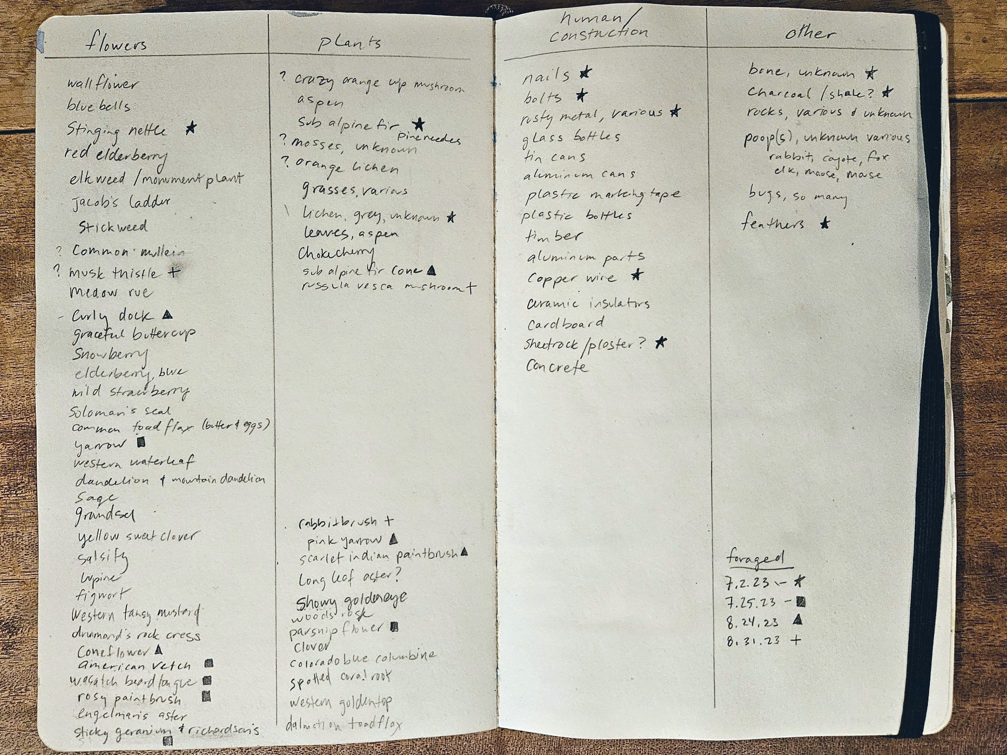
Throughout the summer, when visiting the Ore Bin site, I would take notes on what I found. My record of what I saw and then foraged is shown below in my sketchbook. To be clear, I did not identify EVERY plant I saw - I am no expert in grasses, and I certainly don’t know the fungus or lichens very well (at all honestly). But it’s an interesting record of what grows there. You’ll notice I made notations for which plants or materials I foraged for and when.
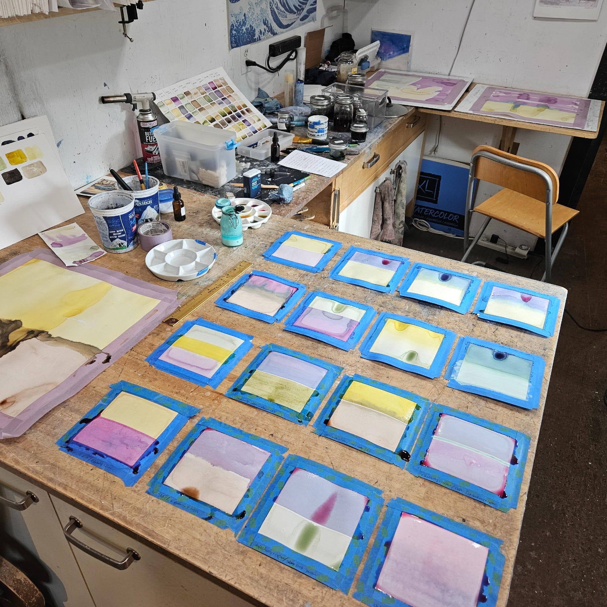
Typically, when I brought home new material, I would make an ink within the next day. I typically make my inks by boiling the plant matter in water to leach out the color. The plant matter is strained from the water, the liquid reduced, and then it is stored in a jar with a couple cloves to serve as a natural preservative. (If you’re interested in how to make your own natural ink, please refer to the book “Make Ink” by Jason Logan*, which is how I learned.) I also experimented with making some lake pigments, but wasn’t as excited about these colors and think I need to practice more. The trick with all of this is that these are living inks, which means they are not necessarily stable. They can go bad, grow mold, or they can change colors when exposed to oxygen or light. I don’t have much control of them honestly, and I never know exactly how they’ll turn out, which is honestly part of what makes it interesting for me.


When in the jar, the inks don’t look like much - most of them look dark, brown, or weird honestly. And yes, some of them did get weird growths by the time I made enough ink, even when stored in the fridge. I had to wait until the end of the summer so the chokecherry and elderberry were finally ripe, because those two colors were pretty critical to getting a full palette of colors. Speaking of colors…. wanna see all of the inks?!

To explain. The top row is the name of the plant, the second row is the ink straight out of the jar, and then each following row is the ink modified by adding another element. This is the fun part and where I feel like I am a witch or an alchemist. By adding modifiers, I can change the color. (Modifiers in order down - Milk Paint Base, Vinegar, Baking Soda, Iron, Alum, Copper). In addition to these ink colors, I was also able to collect lots of rusty bits of metal and copper wire to make an iron and copper ink, both of which are wonderful inks on their own, but make amazing modifiers. I can’t tell you how excited I was when I found copper wire on my first site visit! I also collected charcoal and some plaster on site, which I ground into a fine powders to make inks with as well. I just love looking at that palette and seeing all the amazing colors. Also notice above how Pink Yarrow and White Yarrow make completely different colored inks. So cool.
Then. After I had all my inks, I got to work making the paintings. I began with some small 5x5 inch test paintings to assess the colors, see which colors went well together and to try out some ideas. Then, I scaled up to 18x18 inch paper to make the larger ones. I had intended on making only 10, but got completely carried away and ended up making 21… oops? But they were just so damn fun, I couldn’t stop.


After the ink dried, I painted encaustic wax directly onto the paper in patterns that either left part of the painting exposed or I etched into the wax to create patterns. From there, I rubbed a charcoal, iron, or plaster ink all over the painting, and anything exposed would soak up that ink. This was the ugly stage, and until I wiped or scraped off the excess, it looked a total mess. But the end result left either delicately etched lines or darker areas that obscured the ink behind. Below is the collection of the 16 smaller test paintings, which will be used for my 2024 art calendar. I adore these little 5x5 paintings. They just make me so happy.
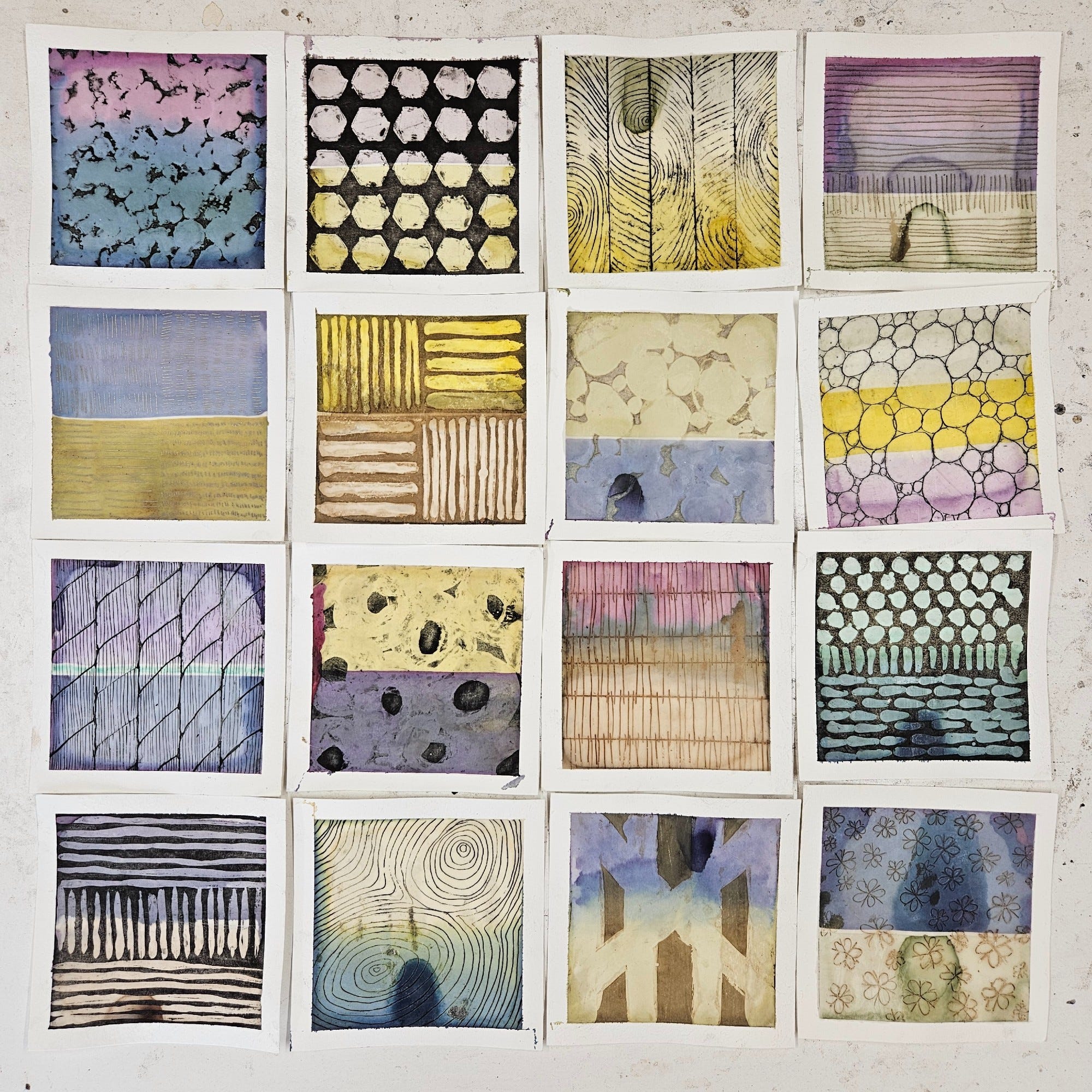
So this new body of work, is directly inspired by last year’s 100 Days of Living Ink, Forest Fire Charcoal and Encaustic project. A continuation on the techniques I learned last year and pushing further to see what I could do still. This year, it was fun to add in iron and plaster to discover how those could be used in the final stage to fill the etchings or cover the areas not protected by the wax.
And now, do you want to see the final paintings? Maybe I should wait until next week for the reveal… Oh fine. Here they are. :)


This week then, I took this whole collection, all 21 large paintings and the 16 smalls into the Park City Historic Preservation Board and their selection committee for this art project. After careful deliberation, the committee narrowed it down to 5 pieces for a vote. There was consideration for how this painting would be viewed by the public without knowing the full context of the work or the site, as well as consideration for what could represent the preservation as a whole. While the committee did finally decide which one they liked the best, we are waiting to schedule a time to share the results with the Park City Council, so I might hold on to this one little detail awhile longer…


So while we wait, I ask you - which one would you choose? Which painting do you think represents the KCOB, the mining site, the natural landscape surrounding it, the historic preservation, or the colors created from all the plants? I have no idea frankly. Even though I made them, I’m not sure I could pick the piece that best represents it all, and I’m so grateful my job was to make them, not to decide. I’d love to hear which one is your favorite. ALSO, what should I do with the remaining 20 paintings?! Halp, please.
*Please note, this is an affiliate link, and I may get a small cut. It’s tiny honestly, I don’t know why I bother….
I loved reading these 2 posts about the process for this project. So interesting. I kind of feel bad for people who will see the paintings without knowing the whole story. My favorites are the last 2 but I wonder how different the encaustic looks in person and I might have different favorites then.